


Looking to bring timeless elegance and modern style to your condo? This recent project demonstrates how classic contemporary interior design can create a sophisticated yet comfortable living space. With a blend of traditional elements and modern touches, this condo was transformed into a refined, functional home that exudes both style and comfort.
The Challenge: Classic Contemporary Interior Design
The client reached out to Decorilla to help design the interior of her mother’s new condo in D.C. The 1,400-square-foot space had light, arched windows, an exposed brick wall—and no clear direction. The goal was clear: make it feel thoughtful, calm, and entirely hers, so the brief for the designer involved:
Create a classic contemporary interior design plan from scratch
Highlight architectural features
Choose furniture that feels permanent but comfortable
Layer textures and color
Avoid orange and yellow tones
Design a classic contemporary living room that feels more lived-in than staged
Pro Tip: Not sure whether classic contemporary interior design fits your style? Try our Free Interior Design Style Quiz to discover your ideal style today!
Design Inspiration: Classic Contemporary Decor
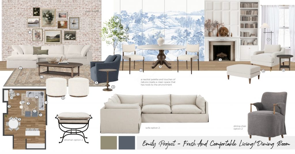
The client didn’t start with a defined style. Instead, she collected designs that felt “right” or depicted things they loved. One used symmetry and warm neutrals to frame a bold central feature—everything else played support. Another was all about statement patterns, with full walls covered in a mural. Still, there was a style connection in the background. It was mostly the transitional tone, classic contemporary interior design where the architecture leads and the decor follows.
Function mattered, too. The client pointed out how seating was always arranged for conversation, not for display. Tables were low and wide, decor sat close to hand. Their version of classic contemporary living room design wasn’t looking for perfection or tags but by how a space felt when someone actually sat in it.
Initial Concepts: Finding the Right Designer
Decorilla assigned two seasoned designers to the project: Maya M. and Erika F., both fluent in the language of classic contemporary decor. The brief left space for interpretation, so each designer approached it from a different angle.
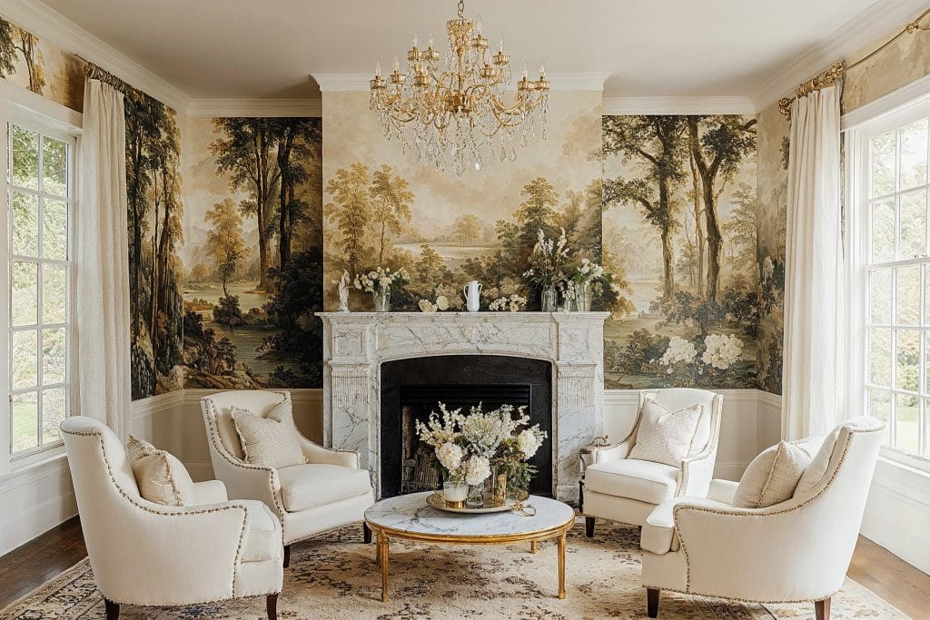
Maya developed a calm, measured scheme with softened lines and pale neutrals. Her moodboard leaned traditional in silhouette but stayed contemporary in material—brass accents, tailored upholstery, layered creams and taupes. It read as composed and understated, with the architecture guiding the tone.
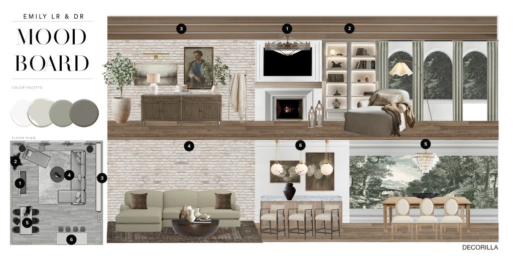
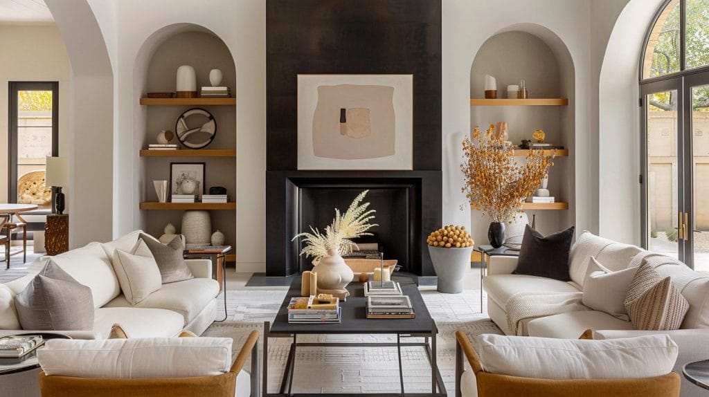
Erika‘s concept worked more directly with the architecture, pulling in deeper colors, sculptural lighting, and bold forms that carried visual weight. She kept the classic contemporary interior design framework intact, playing instead with sharper contrast and clearer rhythm. Her palette was rich and materials choice tactile.
The client chose Erika’s plan, with compelling feedback: “Thanks, these options look great! My Mom really, really likes the baseboard moulding and trim you chose!“
Results Revealed: Classic Contemporary Interior Design
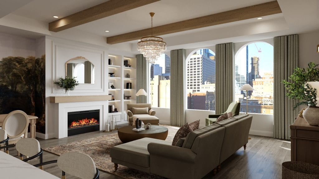
The final design takes advantage of the room’s scale and architectural features, yet it doesn’t let them dictate the entire composition. The high ceilings, exposed brick, and arched windows were already present and carried weight on their own. The designer’s classic contemporary interior design approach works well here because the backdrop allowed layered materials and historical references without tipping the space into period style. The layout reads as a sequence of zones that remain connected but visually distinct.
Classic Contemporary Living Room Design
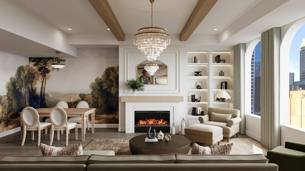
The mural in the dining area holds the edge of the room. It isn’t treated as an accent wall but handled like a continuous part of the architecture. The subject matter and scale give it weight, while the palette folds easily into the rest of the scheme. The classic contemporary decor makes space for this kind of move—one large gesture that doesn’t require contrast to work. The dining set sits quietly in front of it, leaving the mural space to breathe.
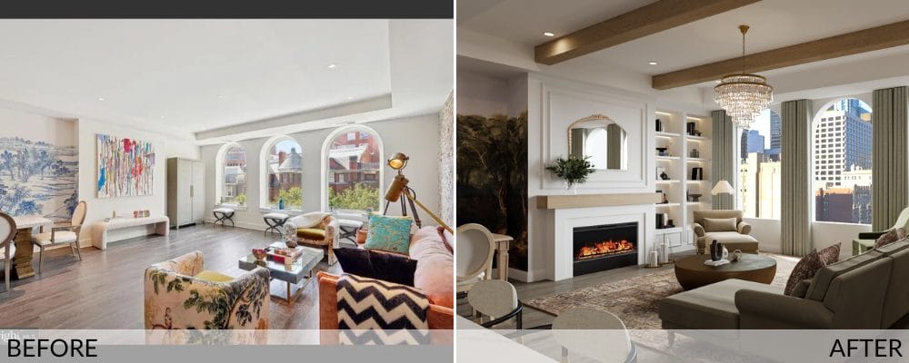
The original interior was dominated by competing shapes and colors, each piece styled independently of the next. In the updated design, the palette is organized, and furniture choices match the room’s scale. The overall feel is calmer and more composed, but not stripped of interest. The classic contemporary living room design gave the room rhythm, which the original version lacked.
Seating is laid out for conversation and ease of movement. The arrangement keeps circulation open without pushing the furniture too far from the center. The palette in the upholstery stays in a restrained range of warm, earthy neutrals, leaving it to textures and silhouettes to draw the lines subtly. The chandelier brings formality but avoids excess. It relates to the mirror and molding more than the furnishings, which keeps the room’s hierarchy clear.
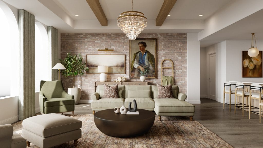
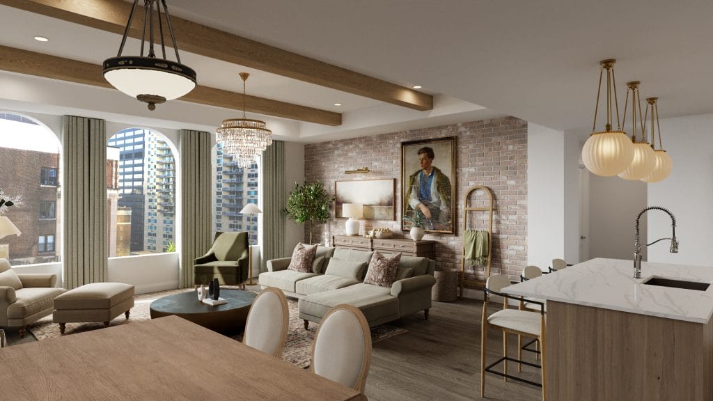
Finally, the brick wall at the back of the room is treated with restraint. The designer didn’t paint it or try to blend it out. Instead, it’s used as a backdrop for artwork and furniture that can hold their own. The mix of styles—portrait, console, decorative objects—is measured to maintain the effect contextual.
Blending Function with Style
The fireplace is new, and acts as a clear visual anchor. The addition of molding and a narrow mantel reinforces the vertical scale, and the mirror above draws the architecture back into the room, reflecting perfectly at the same time the artwork from the opposite wall. Built-in shelves are inset and lit subtly. They hold objects, but they also shape light and shadow along the wall. Together, these changes give the entire elevation structure.
Integrated Modern Kitchen Area
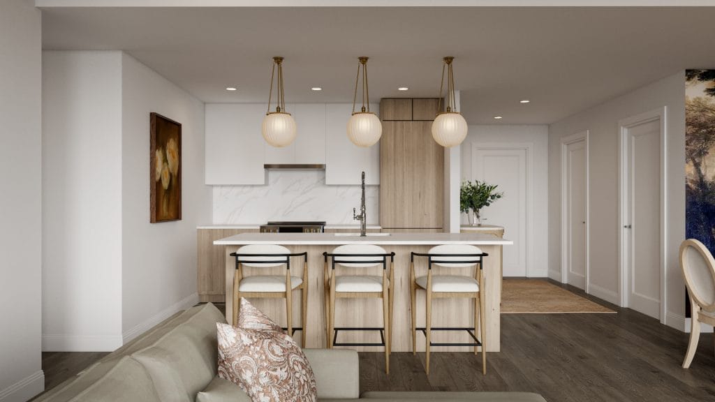
The kitchen is a part of the classic contemporary open-plan interior, yet the design makes it stand convincingly on its own. The lighting is scaled to the space and spaced to match the layout. Pendants sit directly above the island seating and connect vertically with the forms below. That relationship—fixture to counter, counter to the floor—gives the kitchen a steady axis. It also doesn’t draw attention away from the materials, which are already doing the structural work.
The rest of the kitchen stays within that line. Cabinet fronts align with the grain direction. The backsplash stops short of decoration and lands where it needs to: high enough to clear the cooktop, wide enough to remain in scale.
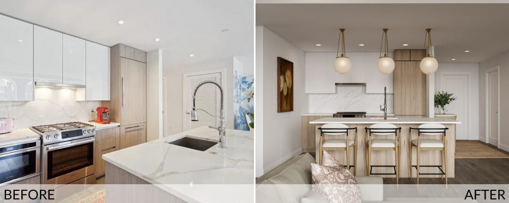
This kitchen design works by removing all visible effort. In the original space, there were too many finishes competing at once—glossy cabinets, two wood tones, chrome, stone. Now the surfaces speak in one tone, and the materials follow the structure.
Classic Contemporary Decor In the Master Bedroom
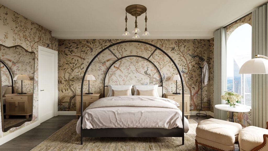
The mural in the bedroom was inherited from the old interior, and the client and designer decided to keep it. Meanwhile, everything around it has been rethought. Instead of competing with other patterns or disjointed shapes, the wallpaper is now the envelope the room is built inside. The bed’s scale was increased to meet that backdrop, and the arched frame draws a single, continuous line in front of the print.
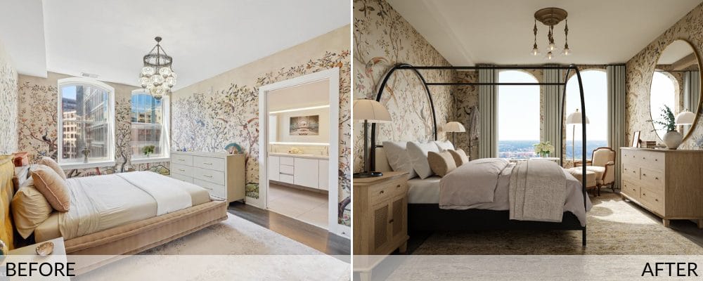
The changes weren’t so much about removing elements as about correcting their scale and placement. The previous layout spread the furnishings too far apart, and the color palette hovered in a middle range that didn’t support the room’s height. The redesign brings the ceiling down visually with a heavier light fixture, and deepens the base tones through the rug and bed. At the same time, it tightens the layout so the elements all read as part of one field.
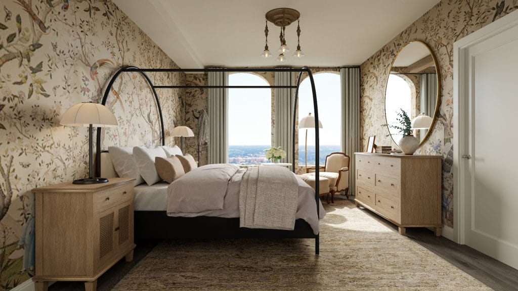
The humble wooden nightstands have the right dose of presence, and the lamps complement the bed’s style. On the opposite side, the mirror and dresser repeat the same material logic—simple wood, clean shape, no carved detailing. That consistency holds the Classic contemporary interior design together and keeps the mural from tipping the room toward ornament.
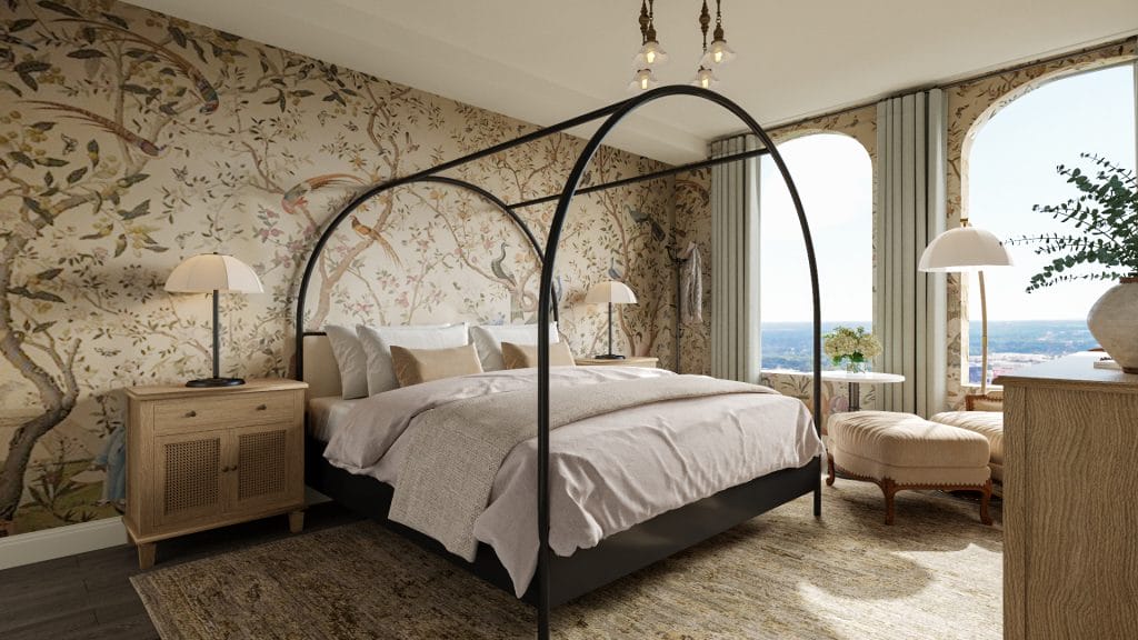
The furniture at the window follows the same pattern. The chairs are soft in shape, but grounded by their base. The curtain panels sit outside the arch, not across it, so the windows stay visible as a structure. The redesign doesn’t mute the detail; it just moves out of its way.
Elegant Guest Bedroom
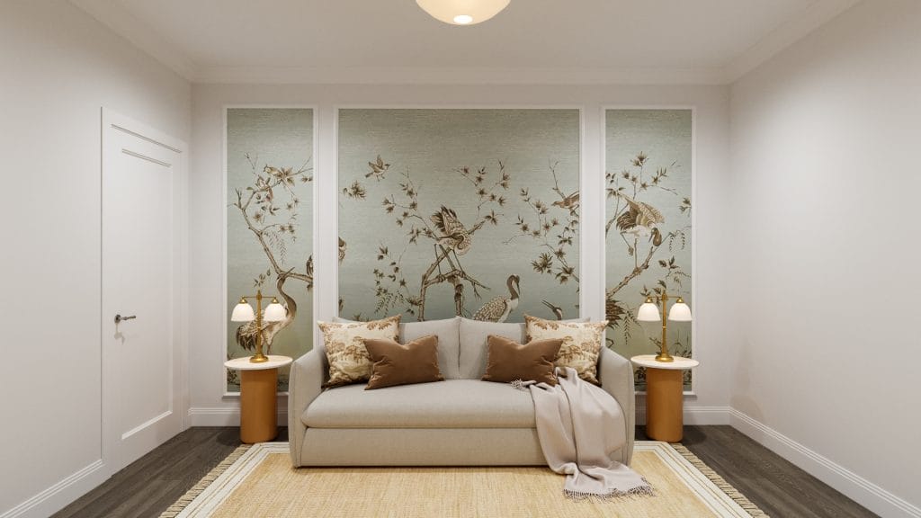
The color remains within one temperature band in the classic contemporary guest room. The soft brown-gold palette—through pillows, rug borders, and side tables—is consistent across textures. The walls are clean but not stark, the mural is muted yet full of detail. Lighting does its job at a human scale, with bedside lamps brought in to frame the sofa as a daybed.
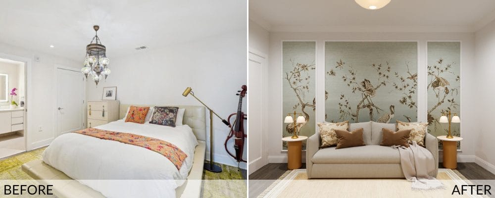
This guest bedroom was shaped by two constraints—sparse natural light and no real depth. Rather than try to counteract those limits with brightness or volume, the design commits to precision.
The classic chintz mural is the anchor, albeit not used as scenery. Framed into three panels, it becomes part of the wall structure and sets the rhythm for the furniture layout. The sofa was selected to fit exactly between them—no more, no less. It’s a small move, but it changes how the room holds scale.
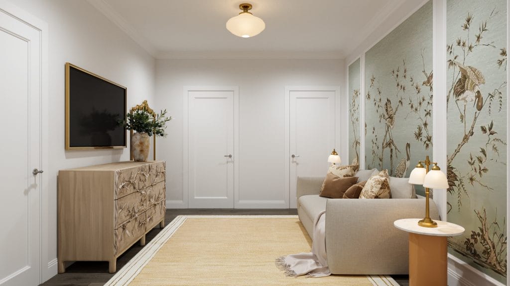
On the opposite wall, the dresser does most of the visual work. Carved fronts introduce enough movement to balance the mural without mirroring it. Nothing else around it competes. The TV floats above in a brass frame that matches the mirror trim and the light fittings. This is classic contemporary decor handled in quiet coordination, free of “pops.”
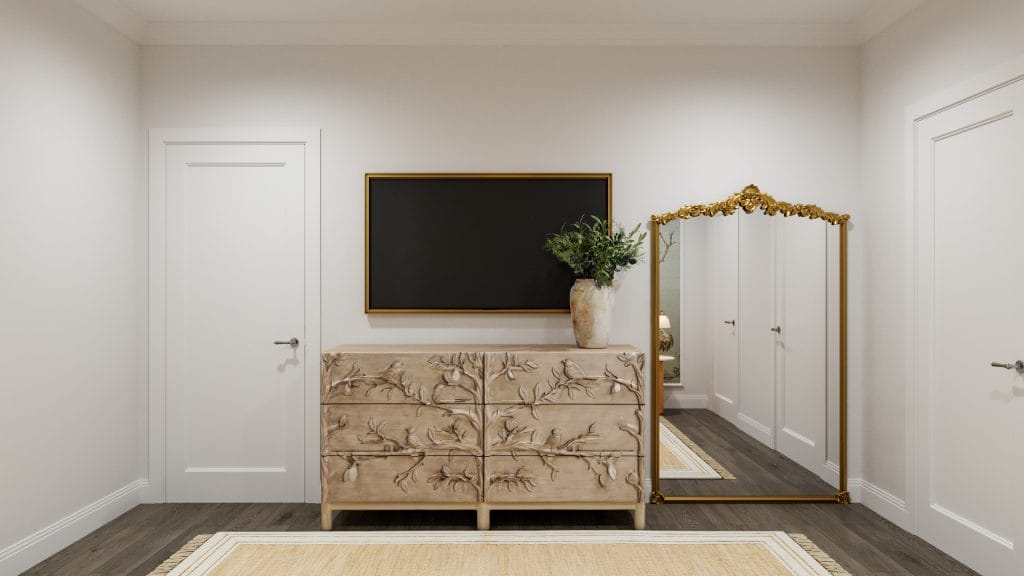
The mirror, though ornate in outline, is placed flat against a white wall and reflected across from the mural. That placement softens the gilding and ties the front and back of the room without imposing the mirror as a focal point. The point here is restraint; the room is rounded up and still leaves space to rest.
Classic Contemporary Interior Design of the Entryway
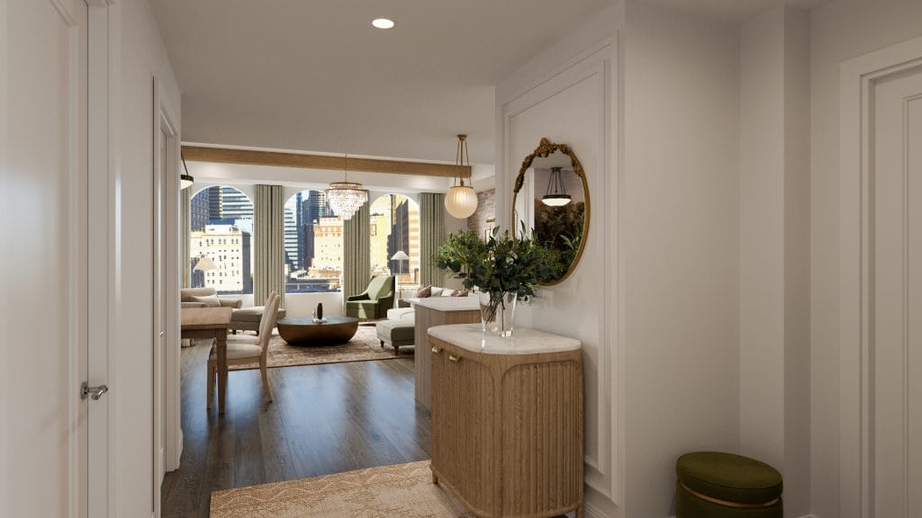
The entryway holds its own; however, it doesn’t stall the eye. From the moment you step in, the line of sight continues unbroken. It’s framed first by the console and mirror, then drawn toward the arches and the city view beyond. Panel molding softens the wall’s edges, and the fluted console adds tactility. The palette and materials here don’t diverge from the rest of the classic contemporary condo; only transition it.
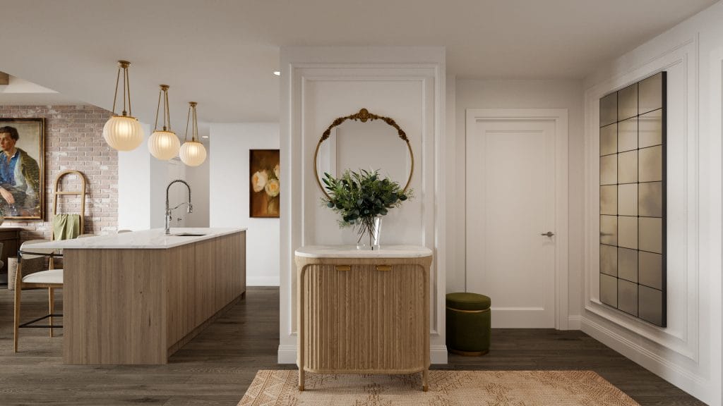
The lighting is warm and diffused, echoing the globe pendants above the kitchen island just a few steps further. Every element, including the olive green ottoman and brass mirror, speaks within the language established throughout the home. This is how the entry earns its purpose: by making the open-plan layout feel composed rather than exposed.
Design Details: Sourcing the Perfect Pieces
Before committing to a single purchase, the client had already walked through their home in 3D. Decorilla’s visual tools didn’t just offer a preview—they mapped out scale, flow, and the nuances of proportion that can make or break a space. This clarity led to confident choices, both aesthetic and practical. It also allowed the designer to respond to preferences quickly and precisely, adjusting the palette, layout, and mood with visible impact.
Budget flexibility gave room for standout pieces, but Decorilla’s trade access ensured the upgrades didn’t come at an unnecessary cost. The process remained structured, transparent, and deeply collaborative from start to finish. Feedback shaped the design every step of the way, including during the final stages. The client’s messages also summed up their satisfaction without hesitation: “The renders arrived! They look stunning! My Mom loves the Master Bedroom!”
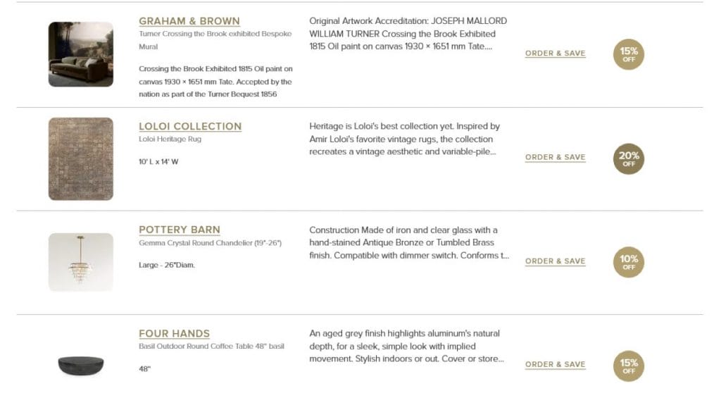
Get the Look: Classic Contemporary Decor
To get the classic contemporary interior design right, skip the formulas and choose what holds a room together. These finds do the job quietly and well.
Looking for classic contemporary interior design for your own home?
Work with professional designers who tailor every detail to your style and space. Book your Free Online Interior Design Consultation to get started today!